
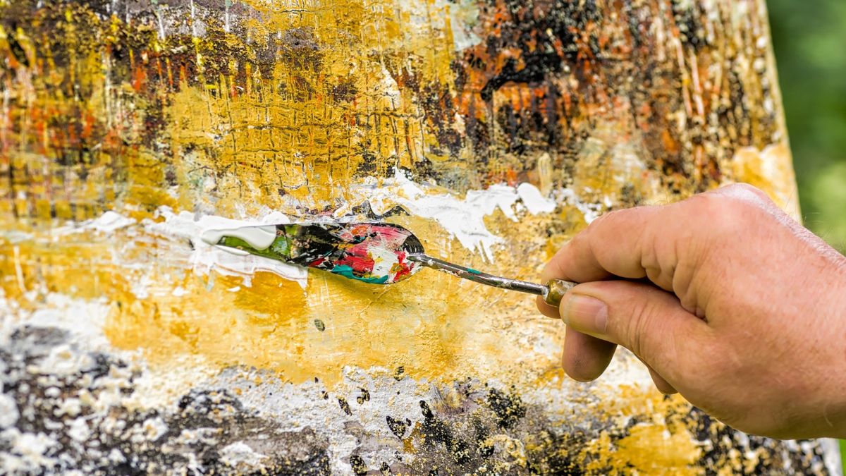
Acrylic painting is beloved for its versatility, quick drying time, and vibrant color possibilities. However, with the vast array of colors available, it can be overwhelming to decide which ones to include in your palette. Whether you’re a beginner or a seasoned artist, having a core set of colors that can be mixed to create a wide range of hues is crucial. In this article, we’ll explore the top 10 essential colors for acrylic painting that every artist should consider.

1. Titanium White
No palette is complete without Titanium White. This bright, opaque white is essential for lightening colors, creating tints, and adding highlights. It’s also indispensable for mixing pastel shades and softening intense hues. The coverage and opacity of Titanium White make it a staple in any acrylic painting.
2. Mars Black
Mars Black is a deep, rich black that can be used to create shadows, add contrast, and darken other colors. Unlike Carbon Black, which can sometimes overpower other colors, Mars Black is slightly more muted, allowing for more subtle shading and depth.
3. Cadmium Red
Cadmium Red is a warm, vibrant red that is perfect for mixing a wide range of colors, from oranges to purples. Its intensity makes it ideal for adding bold, fiery accents to your paintings. If you prefer a cooler red, Alizarin Crimson is a great alternative that can produce more subdued mixes.

4. Cadmium Yellow
Cadmium Yellow is a bright, strong yellow that is indispensable for mixing greens, oranges, and other warm tones. Its opacity and vibrancy make it a favorite for creating sunny highlights and capturing the warmth of natural light. If you’re looking for a more transparent option, Hansa Yellow is another popular choice.
5. Ultramarine Blue
Ultramarine Blue is a rich, deep blue that is perfect for mixing purples and adding depth to skies, oceans, and shadows. Its warm undertone makes it ideal for mixing with reds and browns, producing a wide range of natural tones.
6. Phthalo Blue
Phthalo Blue is a versatile, intense blue that is often used for mixing greens and achieving vibrant cool tones. Its high tinting strength means a little goes a long way, making it a powerful tool in your color-mixing arsenal. Phthalo Blue is excellent for creating rich, jewel-like hues in your paintings.
7. Burnt Sienna
Burnt Sienna is a warm, earthy brown that adds depth to landscapes, portraits, and natural elements. It’s an essential color for creating skin tones, adding warmth to shadows, and toning down brighter colors. When mixed with white, Burnt Sienna produces a lovely, soft peach or terracotta hue.

8. Burnt Umber
Burnt Umber is a darker, more neutral brown that is incredibly useful for shadows, underpainting, and creating earthy tones. It’s a great color for adding depth and contrast without overpowering your composition. Burnt Umber can also be mixed with blues to create rich, deep blacks.
9. Yellow Ochre
Yellow Ochre is a muted, earthy yellow that is fantastic for natural landscapes, skin tones, and adding warmth to your paintings. Its muted tone makes it perfect for mixing with other colors to create soft, subtle hues. Yellow Ochre is particularly popular for capturing the golden light of a sunset or the warmth of autumn leaves.
10. Payne’s Gray
Payne’s Gray is a cool, blue-gray that is ideal for soft shadows and muted tones. It’s a great alternative to black for creating depth and contrast without overpowering other colors. Payne’s Gray is also excellent for creating stormy skies, distant mountains, and atmospheric effects.
Why These Colors?
These 10 colors are essential because they provide a strong foundation for mixing a wide variety of hues. With these colors, you can create an extensive range of shades, from the brightest highlights to the deepest shadows. By mastering the art of mixing with this core set of colors, you can achieve a harmonious and balanced palette that suits any painting style.
Tips for Expanding Your Palette
While these 10 colors are a solid starting point, don’t be afraid to experiment and expand your palette as you become more comfortable with acrylics. Some additional colors to consider include Quinacridone Magenta for vibrant pinks, Cerulean Blue for bright skies, and Sap Green for natural foliage.
Conclusion
Building a strong acrylic painting palette doesn’t require dozens of colors. By focusing on these 10 essential colors, you’ll have the versatility to create a wide range of tones and effects in your artwork. Whether you’re just starting out or refining your technique, these colors will serve as the foundation of your artistic journey.
Happy painting! 🎨